


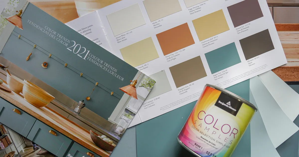
Selecting color palettes that make small rooms feel significantly larger is a foundational skill in interior design that relies on the strategic manipulation of light reflection and spatial perception. By understanding how human eyes interpret depth and boundaries, you can transform cramped, claustrophobic areas into airy, expansive sanctuaries. The goal is to minimize the contrast between walls, ceilings, and architectural features, effectively blurring the lines of the room. As we move into 2026, design trends are favoring monochromatic schemes that prioritize texture over vibrant color, offering a sophisticated way to maximize perceived square footage. Through the intelligent application of light-reflective pigments and cohesive tonal layering, you can create an environment that feels breathable, open, and professionally curated regardless of the actual dimensions.
The Science of Light Reflectance
The primary principle behind enlarging a room through color is the Light Reflectance Value (LRV). Paints with high LRV ratings reflect more light back into the space, which tricks the eye into perceiving deeper corners as closer and more illuminated. White is the traditional champion of this technique, but modern design in 2026 encourages moving beyond sterile, stark whites toward warmer, nuanced neutrals like oyster, cream, and soft greys. These shades absorb enough light to avoid harsh glare while still pushing the walls outward visually. You can find detailed technical data on paint reflectance through the Architectural Digest design archives to help guide your selections.
To truly maximize the effect, consider the finish of the paint. While matte finishes absorb light and hide imperfections, a satin or eggshell finish provides a subtle sheen that increases light bounce. This soft reflection creates a sense of movement in the air, preventing the space from feeling static or boxed in. When you select colors with similar LRVs for both the wall and the trim, you eliminate the visual “frames” that define a room’s boundaries. By treating the walls, baseboards, and window casings as a single, continuous canvas, you prevent the eye from stopping at corners, which is the most effective way to maintain an illusion of infinite space.
Monochromatic Color Schemes
A monochromatic palette is the most powerful tool for expanding a small footprint because it removes the visual clutter of competing hues. By selecting a single color—such as a pale sage or a muted sky blue—and varying its intensity across walls, textiles, and furniture, you create a seamless flow. This technique prevents the “choppiness” that occurs when a room is filled with contrasting blocks of color. In 2026, designers are increasingly using “tonal layering,” where a base color is applied to the walls, and slightly darker or lighter shades of the same hue are introduced in rugs, curtains, and throw pillows to add depth without interrupting the visual field.
Maintaining a cohesive palette also simplifies the decision-making process, ensuring that every object in the room feels like it belongs. When your upholstery closely matches the wall color, the furniture seems to disappear into the architecture, freeing up floor space that would otherwise be visually occupied. If you desire a bit of contrast, reserve it for small, high-impact items rather than large furniture pieces. This strategy allows the room to breathe while still providing the necessary personality and texture required for a comfortable home. For further inspiration on color theory and spatial psychology, you might look into the resources provided by the Interior Design magazine database.
Cool Tones vs Warm Tones
The debate between using cool or warm tones to enlarge a room often hinges on the natural light the space receives. Cool colors, such as light blues, greens, and crisp greys, tend to “recede” visually. This means they appear to move away from the viewer, which effectively pushes the walls back and makes a room feel larger. These shades are exceptionally effective in rooms with limited natural light or those that face west, as they counteract the intense, warm afternoon sun. By choosing a cool-toned palette, you create a tranquil atmosphere that feels cool to the touch and expansive in scope.
The Impact of Warm Neutrals
Conversely, warm neutrals like champagne, beige, or soft terracotta can make a small room feel cozy and inviting. While they do not “recede” as aggressively as cool tones, they provide a sense of comfort that can make a cramped space feel intentional rather than small. The secret to using warm tones successfully is to ensure they remain very light in value. If the color becomes too saturated or dark, it will begin to “advance,” making the walls feel as though they are closing in on you. The best approach is to choose a warm neutral with a high LRV to ensure the room remains bright and airy.
The Role of Trim and Ceilings
One of the most common mistakes in small-room design is painting the ceiling a stark, bright white when the walls are a different color. This creates a hard horizontal line that draws the eye upward and defines the room’s limits, emphasizing its lack of height. Instead, try painting the ceiling the same color as the walls, perhaps in a slightly lighter shade or a flatter finish. This creates a “wraparound” effect that blurs the transition between wall and ceiling, essentially elevating the room and making the ceiling appear higher than it actually is. This unified approach makes the entire structure feel like one cohesive piece.
Baseboards and window trim should also avoid being a point of contrast. In a small space, high-contrast trim acts like a frame on a painting, telling the eye exactly where the wall ends. By matching the trim to the wall color, you remove these visual barriers and allow the eye to travel uninterrupted across the room. If you prefer a bit of definition, opt for a finish change rather than a color change; use a matte finish for the walls and a semi-gloss for the trim. This subtle difference provides enough texture to keep the design interesting without creating the jarring visual stops that shrink a space.
Comparing Design Strategies
To better understand how these techniques impact your space, consider the following comparison of common design approaches for small rooms.
| Strategy | Impact on Perception | Best Use Case |
|---|---|---|
| High-Contrast Trim | Defines boundaries, shrinks space | Large, open-concept rooms |
| Monochromatic Palette | Expands walls, removes clutter | Small apartments, bedrooms |
| Dark Accent Wall | Adds depth, can feel claustrophobic | Focus walls in long, narrow rooms |
| Matching Wall/Ceiling | Raises ceiling, softens corners | Low-ceiling or attic spaces |
Furniture and Texture Integration
Once you have established your base palette, the furniture and textiles you choose must support the illusion of space. Large, bulky furniture with dark upholstery can dominate a small room, even if the walls are painted a light, airy white. Opt for pieces with legs that expose the floor underneath; seeing more of the floor surface makes the room feel significantly larger. Additionally, consider transparent materials like acrylic chairs or glass-topped tables. These pieces occupy space physically but do not block your line of sight, allowing light to pass through them and maintaining the sense of openness you have worked so hard to cultivate.
Texture is the key to preventing a monochromatic room from feeling boring or clinical. Since you are not relying on a wide range of colors for visual interest, you must rely on tactile variety. Incorporate sisal rugs, velvet cushions, linen curtains, or metallic accents to add depth. These materials catch the light differently, creating a sense of dimension that keeps the eye engaged without overwhelming the space. By balancing these varied textures within a tight color palette, you create a sophisticated environment that feels luxurious, expansive, and perfectly scaled to your needs in 2026.
Key Takeaways
- Prioritize high Light Reflectance Value (LRV) paints to bounce light.
- Use monochromatic color schemes to eliminate visual “choppiness.”
- Paint ceilings and trim to match walls to erase room boundaries.
- Select cool, receding tones to physically push walls outward.
- Integrate furniture with legs to increase visible floor space.
- Layer textures instead of colors to maintain visual depth.
Frequently Asked Questions
Can I use dark colors in a small room?
Yes, but use them strategically. Dark colors absorb light, which can make a room feel smaller, but they also create a sense of infinite depth if applied to an entire room, including the ceiling. This works best in cozy spaces like libraries or bedrooms.
What is the best paint finish for small spaces?
An eggshell or satin finish is ideal. It offers enough sheen to reflect light, which expands the space, without being so glossy that it highlights every imperfection in the wall surface.
Does a white room always look bigger?
Not necessarily. If the white is too stark or cool, it can feel clinical. A room with warm, off-white walls often feels more spacious because the warmth makes the room feel inviting and comfortable, preventing the “boxed-in” feeling.
How do I make a narrow hallway feel wider?
Paint the walls and the ceiling the same light color. Using a continuous color scheme eliminates the lines that define the width of the hallway, and adding a long, light-colored runner rug can further elongate the space.
Should I match my curtains to my walls?
Absolutely. Matching your window treatments to the wall color prevents the windows from becoming a visual “stop” point. This makes the walls feel continuous and allows the eye to move smoothly across the entire room.
Conclusion
Mastering the art of color selection for small rooms is about more than just picking a shade of white; it is about creating a cohesive, light-filled environment that removes visual barriers. By utilizing monochromatic schemes, matching trim to walls, and embracing light-reflective finishes, you can fundamentally alter the perception of your home. These professional techniques allow you to transform even the most confined spaces into open, breathable areas that feel significantly larger. As design trends evolve in 2026, the focus remains on simplicity and light, ensuring your living space remains a timeless, expansive retreat from the world.